
CEO Rising®
Anti-status quo business accelerator in NY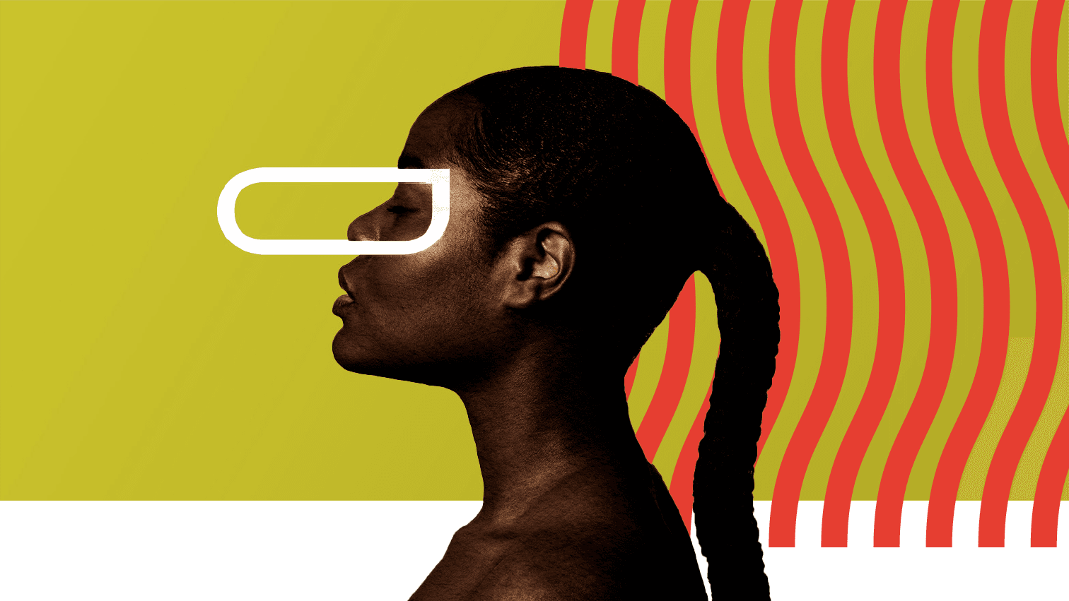
The
Challenge
Lena set out to smash the traditional CEO mold. This brand identity was designed to empower rebels—no matter their race or gender—to rise, lead, and rewrite the rules.
CEO Rising®, a New York-based business accelerator led by visionary strategist Lena West, teamed up with me to lead a full brand revolution. We kicked off with deep discovery sessions that uncovered sharp insights about the business, the industry, and the brand’s bigger mission.
Logo
Design
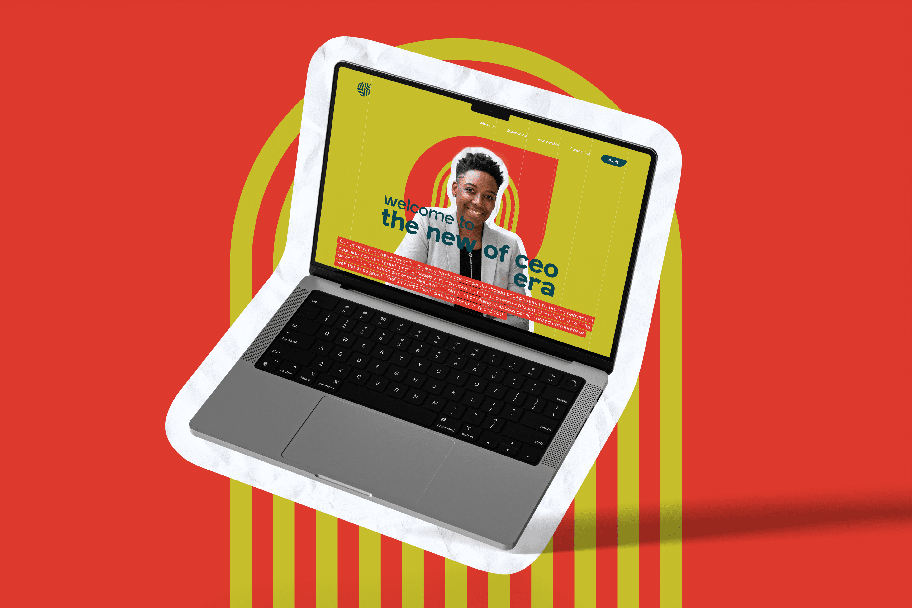
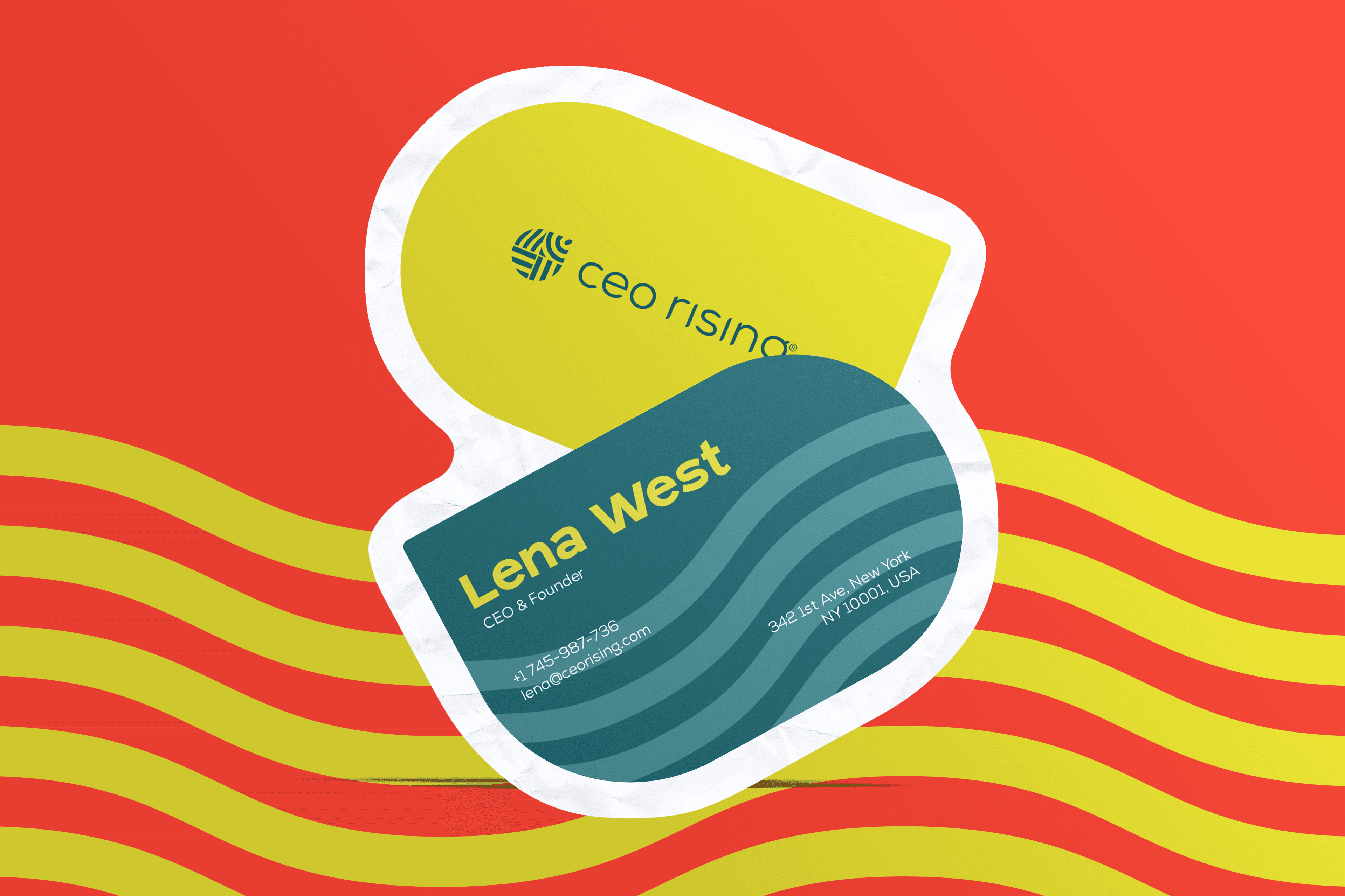
The CEO Rising® logo is a daring emblem of ethical transformation, disruption, and empowerment. Built for a virtual business accelerator that challenges the status quo, the visual identity is designed to reflect this provocative mission. The symbolic icon pairs a circular shape with a sudden sharp edge, divided into four distinct patterns representing the brand's core pillars.
Set in the brand's primary “anti yellow” against deep complementary tones—or accented with an attention-getting red—the palette perfectly mirrors the brand's clear, inspirational personality.


Logo
Design
The CEO Rising® logo is a daring emblem of ethical transformation, disruption, and empowerment. Built for a virtual business accelerator that challenges the status quo, the visual identity is designed to reflect this provocative mission. The symbolic icon pairs a circular shape with a sudden sharp edge, divided into four distinct patterns representing the brand's core pillars.
Set in the brand's primary “anti yellow” against deep complementary tones—or accented with an attention-getting red—the palette perfectly mirrors the brand's clear, inspirational personality.
Brand
Guidelines &
Stationery
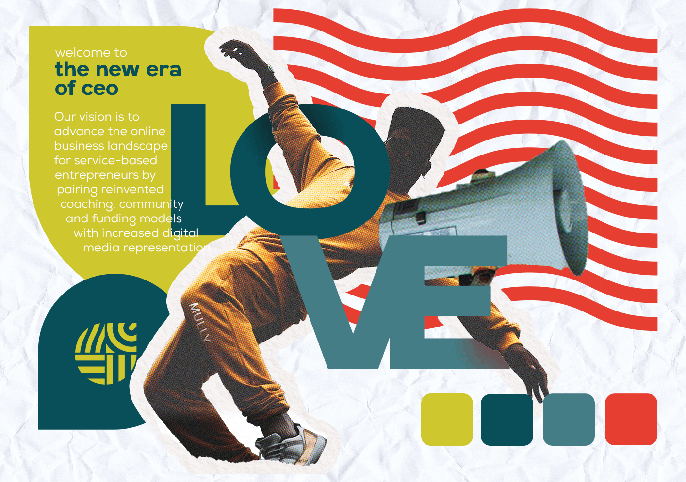
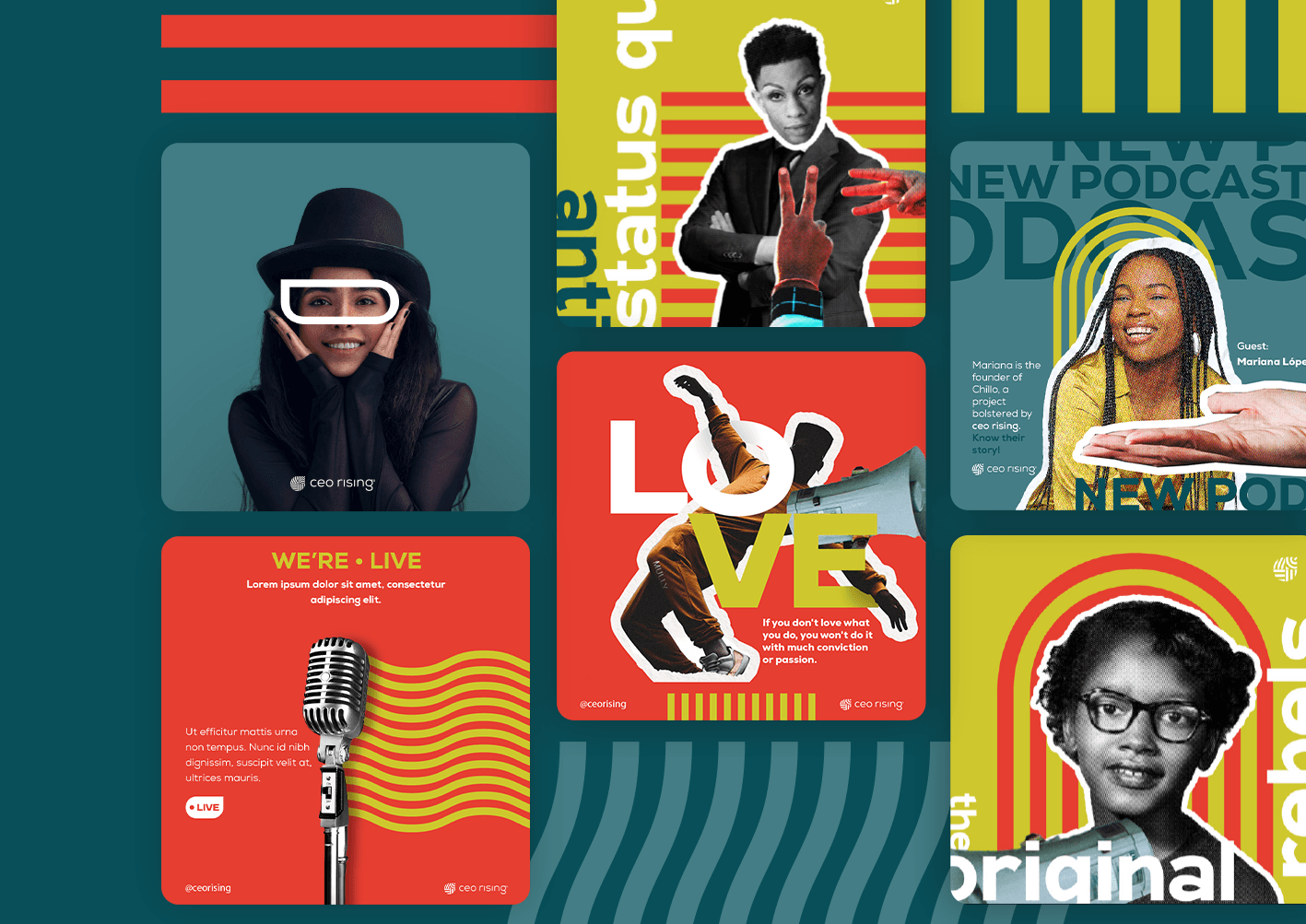
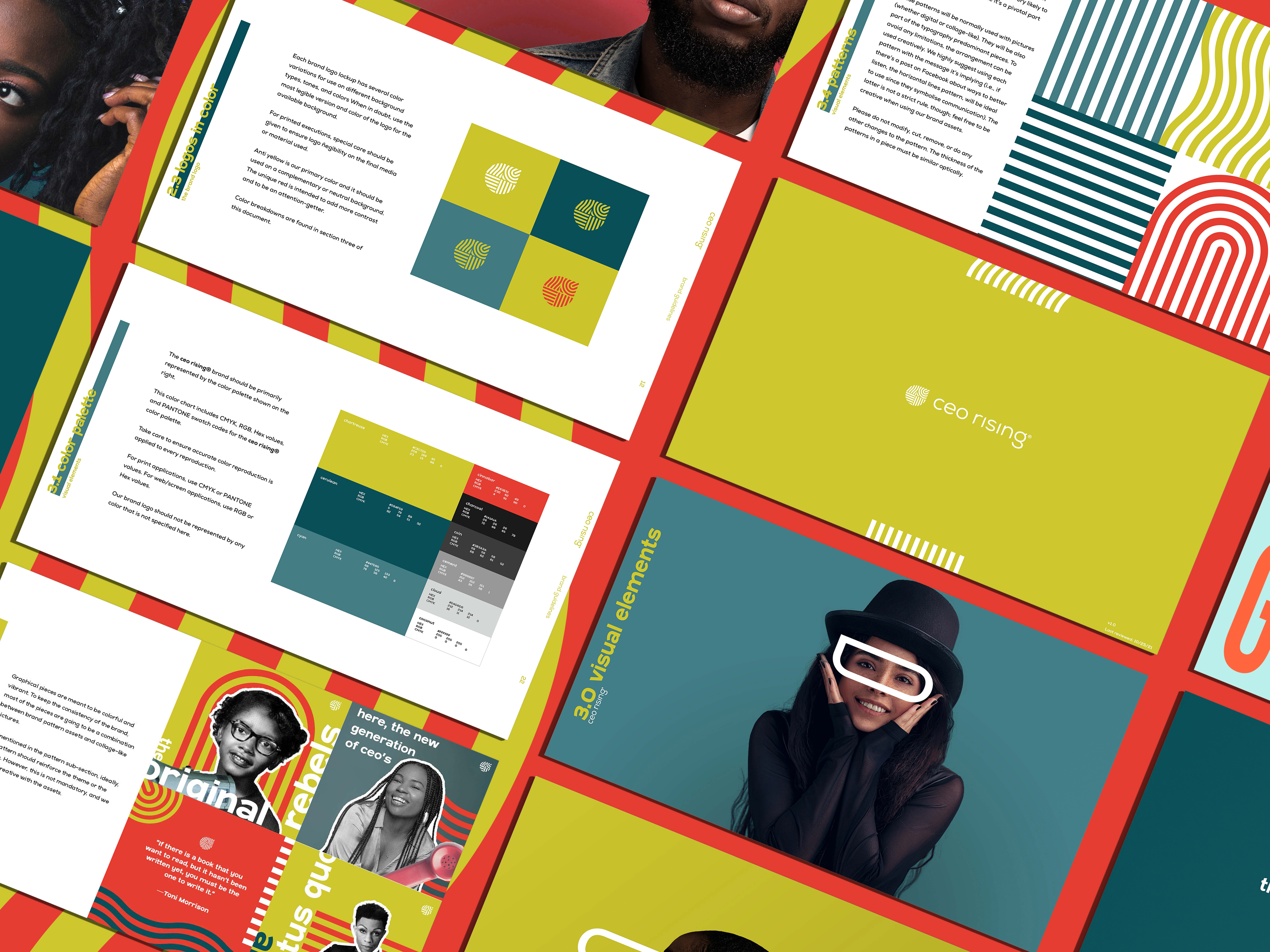
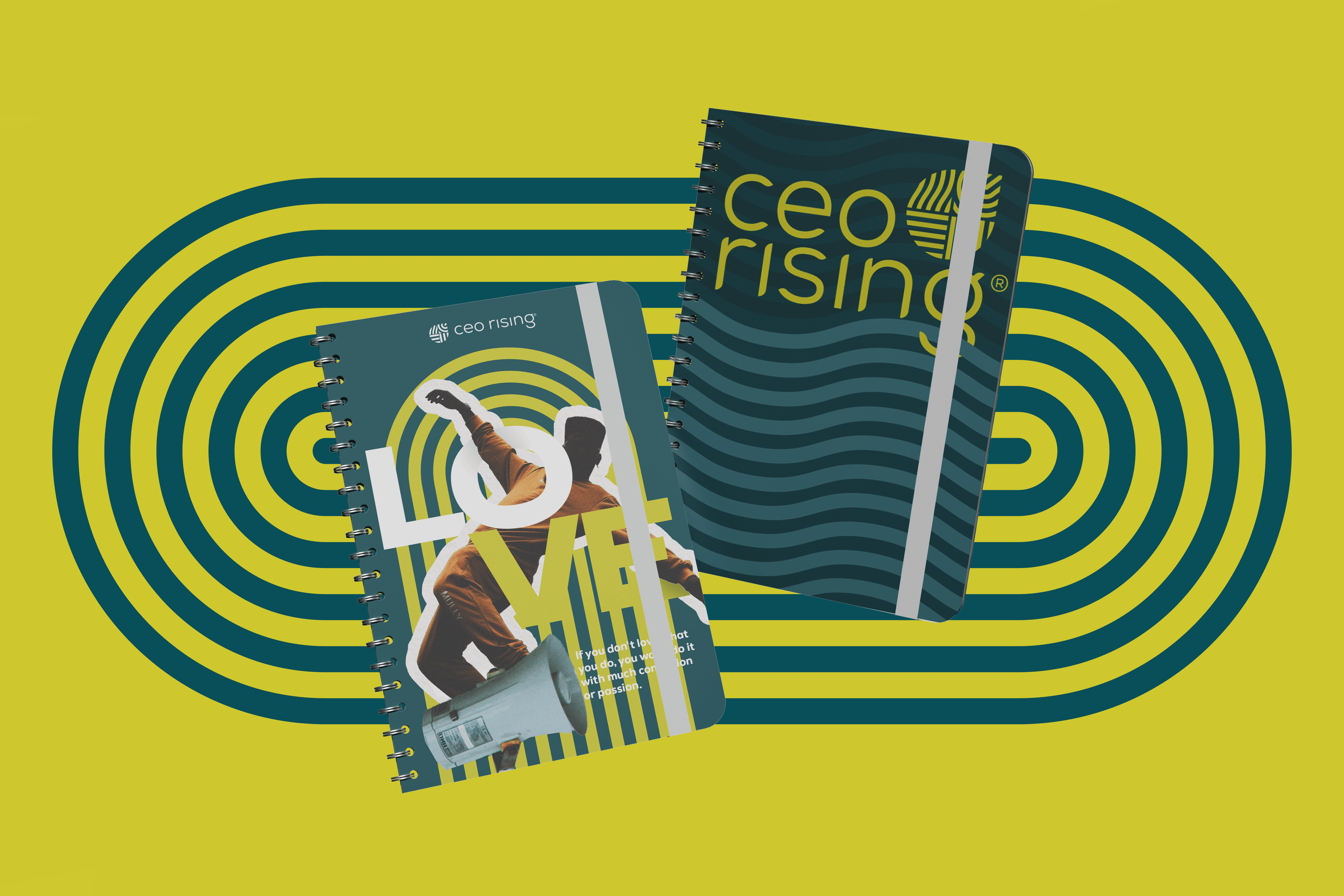
CEO Rising’s brand voice is vibrant, rebellious, and unapologetic. Headlines like "the original rebels," "here, the new generation of ceo's," and "anti status quo" speak directly to an audience ready to challenge conventional business norms.
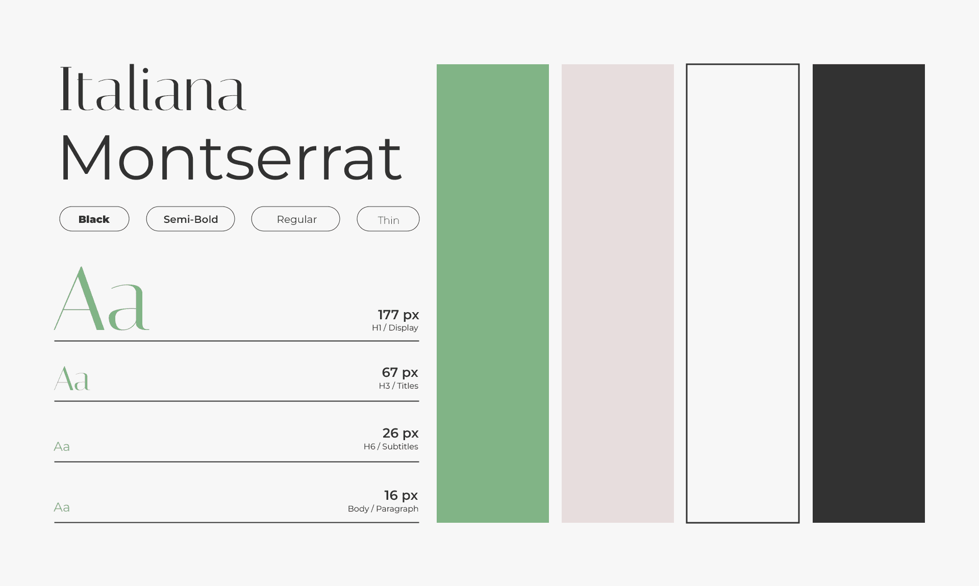
Visually, the identity relies on a bold, high-contrast color palette featuring chartreuse, cerulean, and cinnabar, balanced by grounding neutrals like charcoal and cement. Expressive typography using the Blatant and Nexa typefaces adds distinct character and a highly structured, scalable hierarchy.
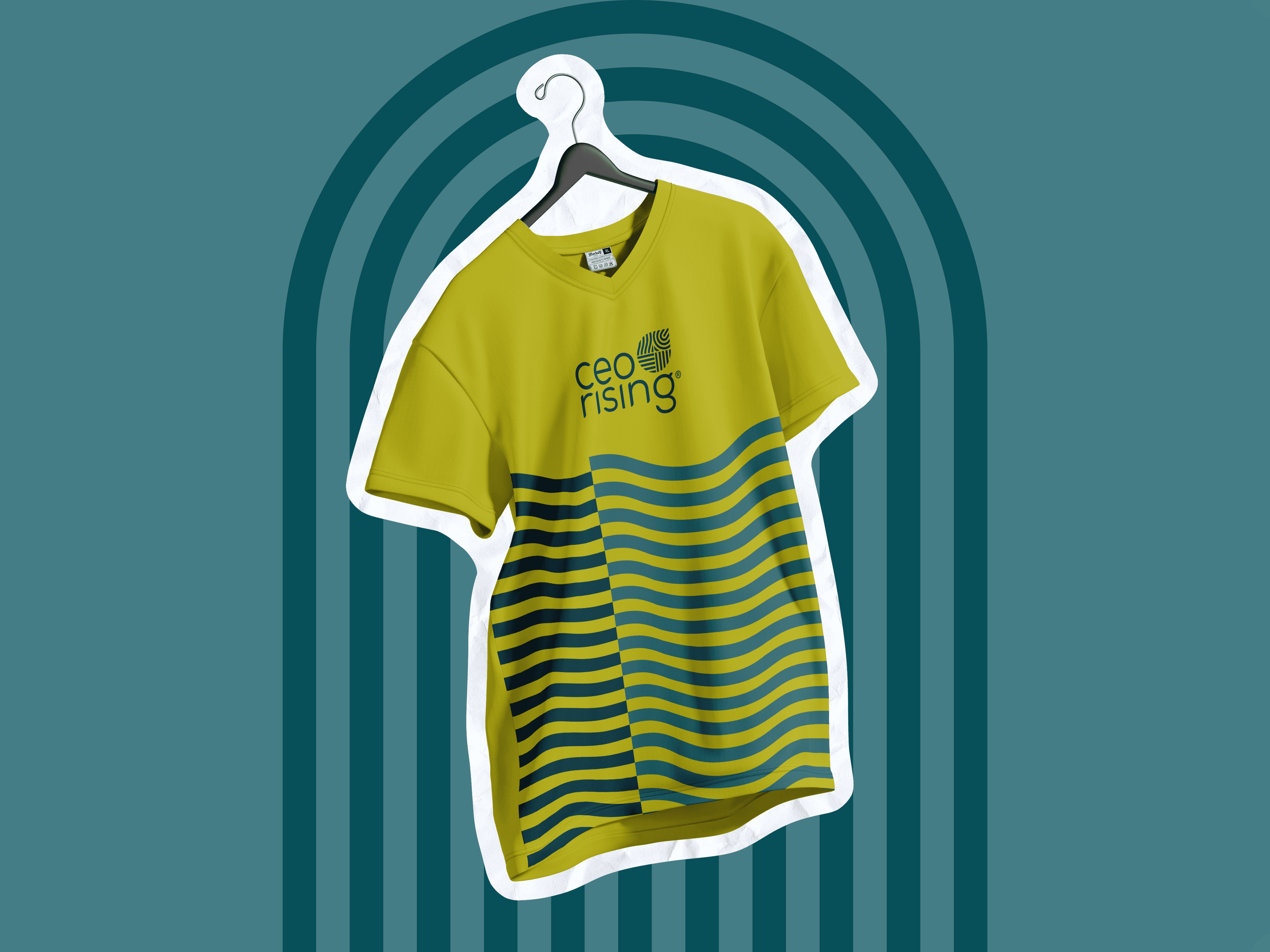
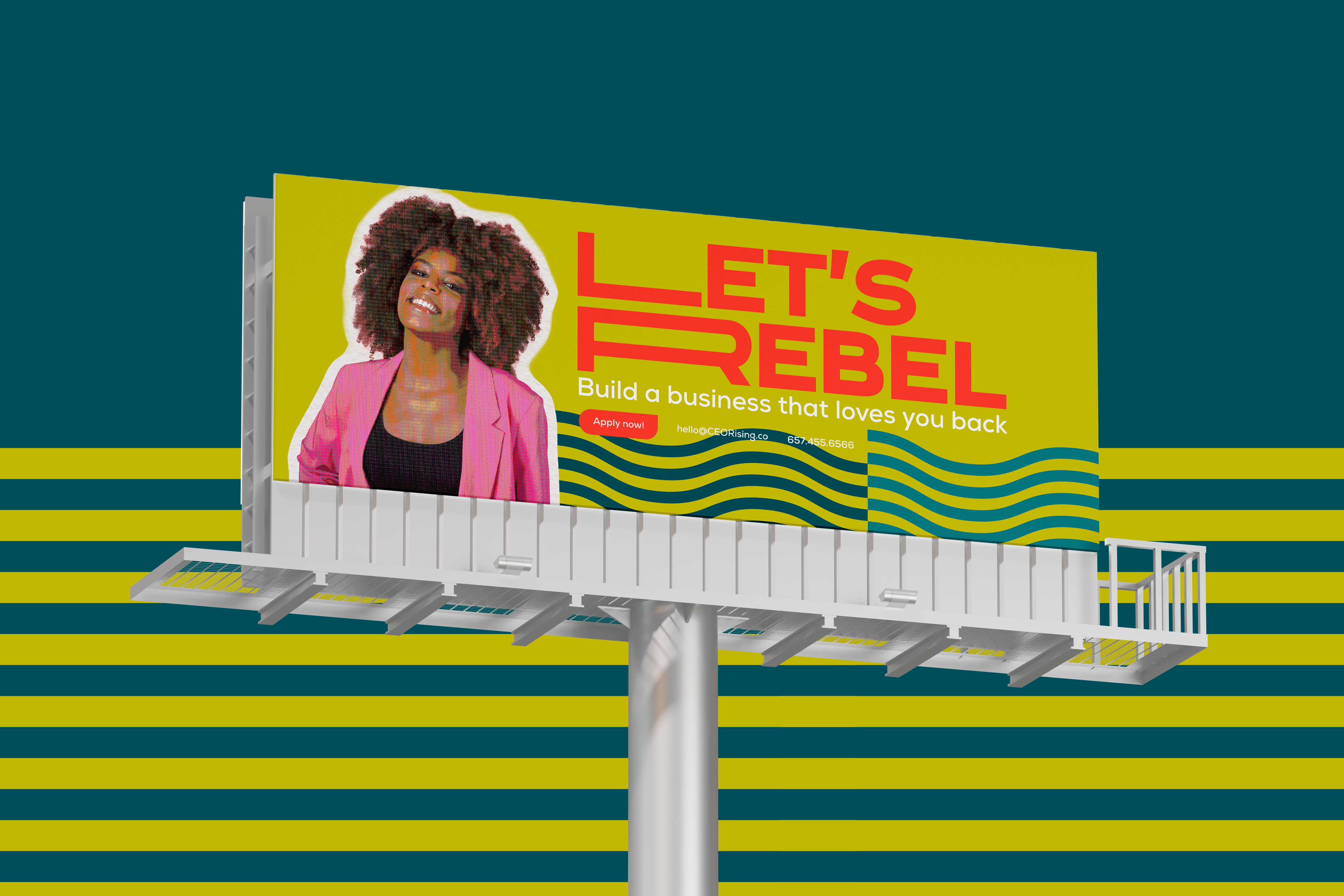
The art direction centers on a colorful, collage-like aesthetic that merges real human expression with design-forward edge. By strategically pairing photography with solid color backgrounds and meaningful geometric patterns—such as using horizontal lines to symbolize communication—the visual assets don't just decorate the message; they actively reinforce it.
The
Result
Lena doesn't follow trends—she questions them. And the brand had to do the same. While most accelerators play it safe, we designed a visual language that zags where others zig. After three high-impact discovery sessions and a strategy rooted in Design Thinking, we landed on a brand that challenges convention at every touchpoint—loudly and proudly.